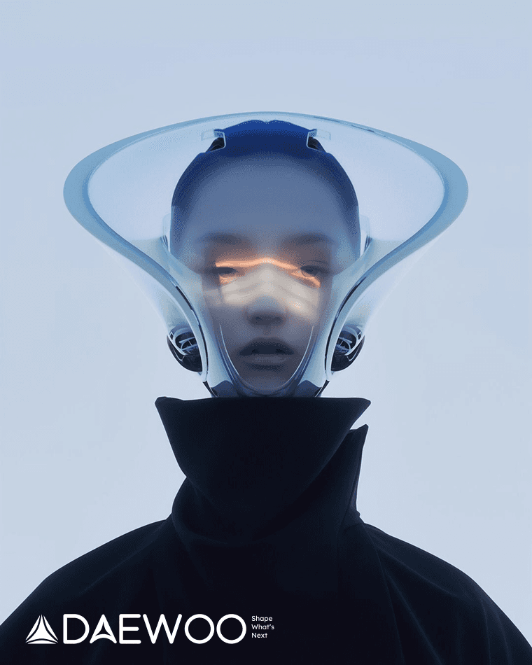
Although Daewoo is no longer active as the same global corporation, its legacy remains familiar to many people. I used this recognition as a starting point to imagine how the brand could return with a clearer, smarter, and more future-ready identity.
Daewoo had strong brand recognition, but its visual identity felt outdated and disconnected from the future technology market. I reimagined Daewoo as a modern technology brand focused on AI, mobility, robotics, and smart living.
Daewoo’s identity still felt tied to its traditional industrial image and needed a clearer future-facing direction.
A legacy name with unfinished potential
I researched Daewoo’s brand history, current perception, and competitors in technology, mobility, robotics, and smart living.
This helped me identify an opportunity to move Daewoo from a traditional industrial image into a more future-focused technology space.
Although Daewoo is no longer active as the same global corporation, its legacy remains familiar to many people. I used this recognition as a starting point to imagine how the brand could return with a clearer, smarter, and more future-ready identity.
Daewoo’s identity still felt tied to its traditional industrial image and needed a clearer future-facing direction.
Daewoo had strong brand recognition, but its visual identity felt outdated and disconnected from the future technology market. I reimagined Daewoo as a modern technology brand focused on AI, mobility, robotics, and smart living.
Futuristic & Minimalist Design → Reinforces the idea of limitless potential—Daewoo is not just a brand; it’s shaping the future, pushing boundaries beyond Earth into a universe of possibilities.
Started the logo process by revisiting Daewoo’s original symbol and the meaning behind its name. “Daewoo” can be interpreted as “Great Universe,” which gave me a strong conceptual starting point.
Rather than creating a completely separate mark, I wanted the new identity to evolve from the brand’s existing heritage. The original rounded industrial symbol was simplified into a sharper triangular structure, while the idea of the universe was translated into three circular elements.
Started the logo process by revisiting Daewoo’s original symbol and the meaning behind its name. “Daewoo” can be interpreted as “Great Universe,” which gave me a strong conceptual starting point.
Rather than creating a completely separate mark, I wanted the new identity to evolve from the brand’s existing heritage. The original rounded industrial symbol was simplified into a sharper triangular structure, while the idea of the universe was translated into three circular elements.
Choosed blue as the primary color because Daewoo needed to feel reliable, familiar, and future-ready at the same time.
Blue connects the brand to trust, technology, stability, and innovation, which helped move Daewoo away from its old industrial image and toward a smarter technology identity.
The deep blue works as the main brand color because it feels confident and professional, while still being flexible enough for digital screens, product interfaces, outdoor campaigns, and social media.
Making the identity sharper and digital
더 확고한 대우의 아이덴티티를 만들기 위한 과정들
What this project taught me
This project taught me that rebranding starts with understanding a brand’s position, not just redesigning its visuals. I learned how to connect research, strategy, and design decisions into one consistent identity system.
By applying the brand across digital, product, and campaign touchpoints, I also learned how important it is for every part of the system to tell the same story.
This project taught me that rebranding starts with understanding a brand’s position, not just redesigning its visuals. I learned how to connect research, strategy, and design decisions into one consistent identity system.
By applying the brand across digital, product, and campaign touchpoints, I also learned how important it is for every part of the system to tell the same story.
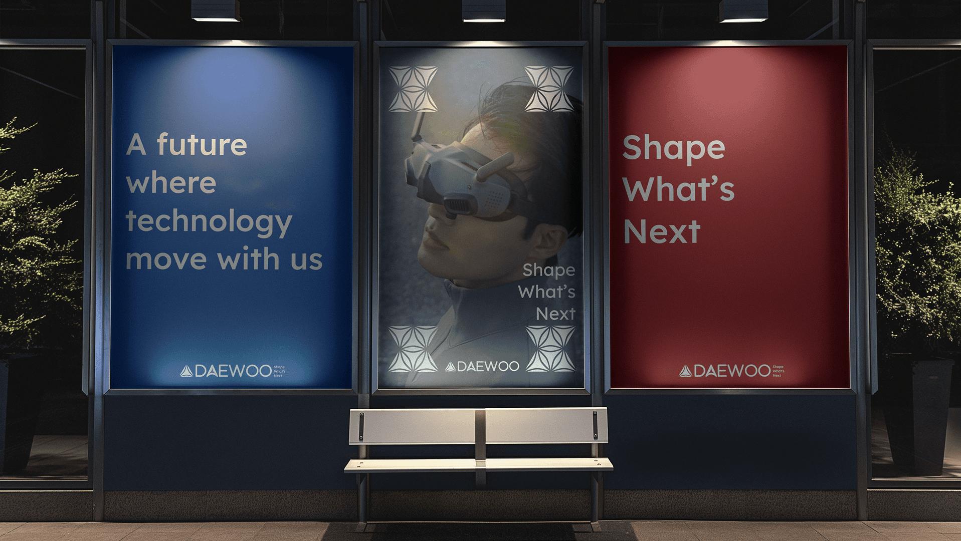
I applied the new identity across billboards, product mockups, and digital screens.
This helped test whether the brand could stay consistent, recognizable, and strong across different environments.
The system in the real world